Are you ready to discover the recurring pattern that’s been driving the success of 2023’s top ads?
How do they come together to form a pattern of success across various products and audiences?
Join us on this journey of discovery, and let’s uncover together the secrets of 2023’s best-performing ads. Ready to dive in?
Want to brainstorm with our team on new ways to scale your business with YouTube Ads (and other performance video platforms)?
Join us for a free YouTube ad brainstorming session 👇
Pattern #1: Captivating opening hooks
In the crowded advertising landscape, the opening hook is your first and often only chance to grab the viewer’s attention. Whether it’s through a surprising statement, a provocative question, or an unusual visual, the opening hook of your ad needs to be engaging. It should shake up the viewer’s world a bit, make them curious, and most importantly, make them want to stay for the whole story. Remember, in the world of direct-response advertising, the battle for attention is won or lost in the first few seconds. Make those seconds count!
Let’s break it down with real examples from the ads we’ve analyzed.
The unexpected twist
A great opening often defies expectations, presenting something unexpected. This tactic is all about disrupting the viewer’s routine scrolling pattern with something that demands attention.
Examples:
“Forget cucumbers – spoons are the new eye therapy!”
Now, isn’t that a twist? This line takes a mundane concept and turns it on its head, igniting curiosity.
“There’s one simple vision hack anyone can use.”
This line makes you ask, “What could it possibly be?” It’s simple, yet it promises something out of the ordinary.
Power of the provocative question
Questions are powerful. They don’t just seek answers; they provoke thought. The right question in an ad can engage your audience’s mind and keep them hooked.
Examples:
“Did you know you can generate an endless supply of power from the ground beneath you?”
Now, that’s a question that challenges what you know and makes you want to stick around for the answer.
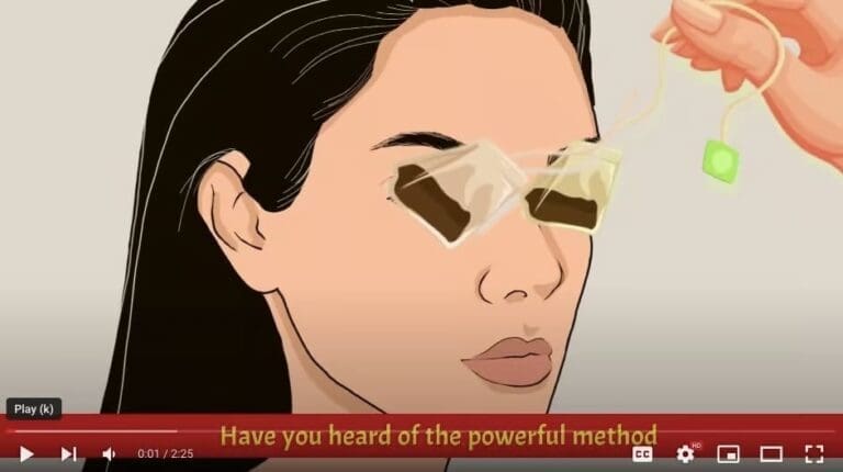
“Have you heard of the powerful method to achieve almost 20/20 vision without surgery?”
If you’ve struggled with vision issues, this question directly speaks to you.
Tapping into the unusual visuals
Ever seen something odd in an ad and couldn’t look away? That’s the hook! In a world where everyone’s seen everything, something different catches the eye.
Examples:
An ad shows a person peeling off chunks of gross, odd-looking pitches from their feet. This bizarre visual instantly captures attention and raises questions about why such a strange, off-putting image is being used.
The image of tea bags being placed on the eyes, used in another ad, creates a similar effect, tapping into the viewer’s curiosity about unconventional health remedies.
Pattern #2: Shock wave, claims that captivate
Have you ever seen an ad that made you think, “Wait, what?” That’s the power of a shocking claim. But why do these bold, often unbelievable statements grab our attention so effectively?
Shocking claims tap into our basic psychological instincts. They create a conflict between our existing beliefs and the new information presented. This conflict is uncomfortable, and as humans, we seek to resolve this discomfort by seeking more information. But what makes them such a staple in winning ads?
What makes a claim shocking?
Shocking claims are bold, but their boldness is not without purpose. Let’s think about it. When you come across a claim that goes against what you’ve always believed, it creates a little spark of confusion, right? This confusion is actually a powerful tool. It jolts your brain out of its usual thinking patterns and makes you pay attention. It’s like hearing someone say, “Eating chocolate helps you lose weight.”
Examples:
“Vision impairments have nothing to do with your eyes but with your brain.”
Notice how the mention of the brain here isn’t just for effect. It elevates a common vision problem to a matter of brain health, sparking instant concern. It’s strategic; it makes the issue feel more systemic and more critical. You can’t help but think, “This is serious; I need to know more.”
“Type 2 diabetes is not about poor eating habits, and you won’t need more doctor’s visits.”
This isn’t just a claim; it’s a confident, bold declaration. For a serious health condition like diabetes, suggesting an end to doctor visits is a huge statement. It’s so assertive, so certain, that it leaves you wanting to know more.
Pattern #3: Problem development, ads that address the mess
Ever wondered why some ads spend so much time talking about the problem instead of jumping straight to the solution? There’s a method to this seeming madness. It’s not just about outlining an issue; it’s about connecting, resonating, and preparing the ground for the solution. But how exactly does this work in direct-response advertising? Let’s explore using real snippets from the ads we’ve been dissecting.
Why focus on the problem?
The best ads don’t just present problems; they make them ours. Think about it. When you hear an ad detailing a problem you’ve experienced, doesn’t it feel like they’re talking directly to you? It’s about creating a connection. The more an ad delves into a problem, the more you, as a listener or viewer, feel understood.
Examples:
“Are you tired of bumping into furniture or mistaking your cat for a hat?”
This isn’t just a quirky question; it’s an evocative image that many with vision problems can relate to. It’s not talking about vision in the abstract; it’s talking about how vision problems can affect your everyday life in frustrating, even humorous ways.
“If you’ve been feeling tired all the time or start feeling tingling sensations in your hands and feet…”
This line goes beyond listing symptoms; it describes a lived experience. For those dealing with these issues, it’s not just a list; it’s a recount of their daily challenges.
Shared problem: Setting the stage for the solution
Have you ever heard an ad and thought, “That’s exactly what I’m going through”?
When an ad shows that it understands the viewer’s problem, it sets the stage for presenting the solution as a personalized answer.
Examples:
“No matter what type of glasses you wear or what eye treatments you try, you’re only treating the symptoms, not the root cause.”
Here, the ad is amplifying the inadequacy of current solutions, making you yearn for a real answer.
“Many people continue to take blood sugar medications… but these are nothing more than old sayings that have been proven by new studies to be false.”
This statement from a diabetes ad challenges the status quo, intensifying the need for a new, more effective solution.
Pattern #4: Solution, complexity vs. simplicity
In direct response advertising, introducing the solution is an art. It’s about capturing the moment of need and turning it into a moment of hope.
When an ad shifts from detailing the problem to introducing the solution, have you noticed that moment of anticipation? It’s like the turning point in a story. But it’s not just about presenting a solution; it’s about how creatively and uniquely it’s introduced. Let’s explore this transition, focusing on the contrast between the problem’s complexity and the simplicity of the solutions offered.
Why highlight the simplicity of the solution against the problem’s complexity? Because it promises relief. After detailing the multifaceted nature of the problem, presenting a solution that’s surprisingly simple can feel like a breath of fresh air. It suggests that relief is not just possible but easily attainable.
Examples:
“A simple seven-second vision ritual you can begin to apply tonight, which is now scientifically proven to restore your vision back to clarity.”
The ad contrasts the complex issue of vision impairment with a ritual so simple it takes only seconds.
“A powerful 30 seconds method which has been clinically proven to restore normal sugar levels.”
This diabetes management ad contrasts the ongoing struggle and complexity of managing diabetes with a quick, effective solution. Note how smartly visuals are cooperating with the copy to keep the curiosity.
Pattern #5: Scientific backing and testimonials for credibility
Have you ever wondered why an ad suddenly shifts from making claims to quoting scientists or showing testimonials from real people? It’s not just a change in tone; it’s a strategic move to build credibility. In the realm of direct-response advertising, trust is king. But how do scientific backing and testimonials contribute to this trust? Let’s delve into this aspect, dissecting how these elements bolster the ads’ claims.
Why trust science in an ad?
Think about it. When an ad mentions a study or quotes a scientist, what does that do for you? It adds weight, doesn’t it? Science is associated with research, facts, and truth. So, when an ad claims scientific backing, it’s not just making a claim; it’s offering proof. But is this always enough?
Examples:
“Top researchers from the University of Cambridge have made a startling discovery…”
This isn’t just a claim; it’s an assertion backed by a prestigious name, lending it immediate credibility. It makes you think, “If Cambridge researchers are behind this, there must be something to it.”
“This method is clinically proven to restore your hearing back to normal.”
The phrase “clinically proven” is a powerful one. It suggests rigorous testing and verification, which can significantly assuage doubts about the efficacy of the solution. We can all wonder here: if the specific mention of a renowned name could yield better results in terms of trust and credibility. This sounds impressive, but does it hit as hard as naming an actual institution?
The power of testimonials
But why include testimonials? Because seeing real people vouch for a product or service makes it relatable and trustworthy. Testimonials bridge the gap between the viewer and the product, showing that others like them have found success and satisfaction.
Examples:
“70-year-old patients…are now seeing better than ever.”
Imagine yourself or a loved one in those shoes. This isn’t just a random success story; it’s a relatable outcome that many desire.
“More than 157,000 people of all ages are already doing this…”
That’s a lot of people. Doesn’t a number that large make you think there must be something to it?
Pattern #6: Calls to action: The power of "now" and "today"
In the world of direct-response advertising, a powerful CTA is the final nudge that turns interest into action. By adding a sense of urgency, advertisers don’t just suggest what you should do next; they compel you to do it immediately.
Why do words like “now” and “today” make us want to act immediately? It’s because they create a sense of urgency, a fear of missing out (FOMO). That’s a specific type of urgency in calls to action (CTAs) where the risk of losing out is highlighted. It’s a potent method that taps into our natural aversion to loss.
Why do we respond so well to urgency in CTAs? It’s a mix of wanting to seize opportunities, the fear of missing out, and the desire for instant gratification. But how do these psychological triggers work together to make us act?
Examples:
“This special presentation may not be available for long.” or “Click the watch now button below before it’s too late.”
Here, the ad suggests that the opportunity is fleeting. Does the idea of losing access make you want to click right away?
“This presentation has been taken down twice before and might not be available much longer.”
Here, the ad creates a narrative of risk – the information is so valuable that there’s an active effort to remove it. Doesn’t that make you feel like you’re about to lose access to something critically important?
As we wrap up our journey through the captivating world of 2023’s most successful ads, we hope you’re leaving with a treasure trove of insights and inspiration.
It’s about more than just understanding these ads; it’s about harnessing their power for your own endeavors. Whether you’re crafting your next campaign, looking to enhance your brand’s impact, or simply aiming to appreciate the finer points of persuasive communication, the lessons here are invaluable.
So go ahead, make your mark, and perhaps your ad will be the one we’re all talking about in 2024.
Ready to make some waves?
The stage is yours.
Want more content like this?
Don’t miss out on the latest news and updates from the world of Direct Response advertising! Subscribe to our newsletter today 👇

Vesna Vukanovic Dumanovic, Account Manager
Armed with a PhD in Knowledge Management, as well as insatiable curiosity and a can-do attitude, Vesna is an organizational powerhouse on our team. As a veteran in project management, there's no question or task you can throw at her that she wouldn't be able to tackle. That's why she's the go-to resource for education, development, and support not just for our team but for Inceptly's clients.
Want to brainstorm with our team on new ways to scale your business with YouTube Ads (and other performance video platforms)?
Join us for a free YouTube ad brainstorming session:
Like this post? Let's continue the conversation!
Get in touch with us by shooting us a quick email or tagging us on LinkedIn or Instagram, and sharing your thoughts. Your feedback helps us keep our blog relevant and interesting.
Get Our Newsletter
Need Help?
Get in touch with us for an insightful evaluation of your ads + actionable tips to help amp up your direct response revenue


