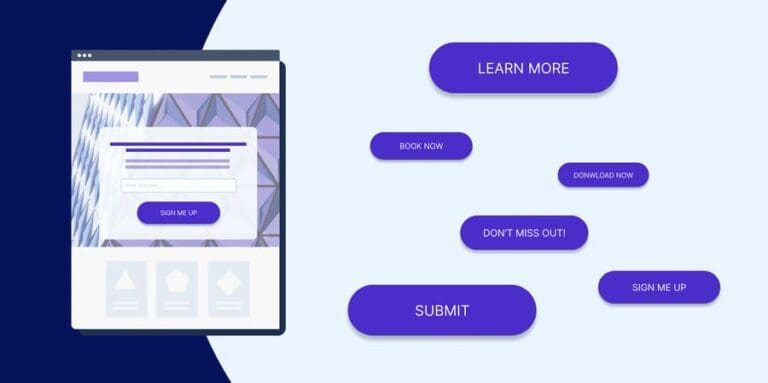
Sick of guesswork when writing YouTube ad copy? Crafting what you think are kickass headlines and calls to action, but still not sure if they’ll convert?
I feel you.
But what if you could eliminate the confusion and see exactly what makes your audience click?
With creative ad testing methods, you can methodically try different ad copy elements to learn what hits the mark.
Want to brainstorm with our team on new ways to scale your business with YouTube Ads (and other performance video platforms)?
Join us for a free YouTube ad brainstorming session👇
In this post, we’ll look at some creative, yet underused ways to test YouTube video ads. We’ll explore tips for optimizing headlines, calls-to-action, opening lines, and body text – all the key elements.
Together, we’ll walk through how to set up controlled experiments, calculate significance, and find the highest-performing copy for the videos with confidence.😎
Understanding A/B testing 🔍
A/B testing, also known as split testing, is a method of comparing two versions of an ad to see which one performs better. By showing the two versions (A and B) to different segments of your audience simultaneously, you can measure which one yields better results.
Why it works
A/B testing eliminates guesswork by providing data-driven insights. It allows you to test various elements of your ad copy—such as headlines, CTAs, and visuals—one at a time, to see which changes have the most significant impact on performance. According to a study by VWO, companies that use A/B testing can increase their conversion rates by up to 49%.
Why you should do it
Implementing A/B testing can help you:
Improve ad performance by identifying the most effective copy elements,
Understand your audience’s preferences and behavior,
Optimize your marketing budget by focusing on high-performing ads.
Example: Suppose you want to determine whether a “Learn More” or “Sign Up Now” CTA performs better in your ad. By running an A/B test, you can show each version to different segments of your audience and measure the conversion rates to see which CTA drives more sign-ups.
Nailing those headlines 🎯

Crafting headlines that grab attention and drive clicks is both an art and a science. The headline is the first thing your audience sees, and it’s crucial to get it right. Let’s dive into some creative ways to A/B test your YouTube ad headlines to ensure they resonate with your viewers.
Why headlines matter
A compelling headline can significantly increase your video’s view rate. According to a study by Copyblogger, 8 out of 10 people will read the headline, but only 2 out of 10 will read the rest. This underscores the importance of making your headline as effective as possible.
Testing different headline styles
The power of numbers and lists: People love lists and numbers because they promise quick and digestible information. Test headlines like “5 Tips to Boost Your Sales” vs. “Boost Your Sales with These Tips” to see which format drives more clicks.
Case study: A campaign by Conductor found that headlines with numbers had a 36% higher click-through rate compared to those without numbers.
Questions vs. statements: Questions can engage curiosity and make viewers want to find out the answer. Try testing a question-based headline like “Are You Maximizing Your Ad Spend?” against a statement-based one like “Maximize Your Ad Spend with These Tips.”
Emotional triggers: Headlines that evoke emotions can be incredibly effective. Test emotional triggers by using words like “amazing,” “heartbreaking,” or “unbelievable.” For example, “Unbelievable Ways to Increase Your ROI” vs. “Effective Ways to Increase Your ROI.”
Personalization: Personalized headlines that speak directly to the viewer can increase engagement. Test headlines that use “you” and “your” to see if they perform better. For example, “Your Guide to Better Ad Copy” vs. “Guide to Better Ad Copy.”
Setting up your test
Hypothesis: Formulate a clear hypothesis for each test. For example, “Headlines with numbers will have a higher click-through rate than those without.”
Variables: Change only one element at a time. If you’re testing numbers in headlines, ensure the rest of the headline remains the same.
Metrics: Decide which metrics will determine success. Typically, you’ll look at the click-through rate (CTR) and view rate.
Duration and sample size: un your test long enough to gather significant data, and ensure you have a large enough sample size to draw reliable conclusions.
Example test setup
Imagine you’re running a YouTube ad campaign for a new productivity app. Here’s how you might set up your headline A/B test:
Headline A: “10 Ways to Skyrocket Your Productivity”
Headline B: “How to Skyrocket Your Productivity”
Metrics to track: CTR and view rate.
Duration: Two weeks or until you reach a statistically significant sample size.
By analyzing the results, you can determine which headline resonates more with your audience and drives higher engagement.
Crafting effective CTAs 🚀
Now that we’ve covered headlines, let’s move on to another critical element of your YouTube ads: the call-to-action (CTA). A strong CTA can drive viewers to take the desired action, whether it’s visiting your website, signing up for a newsletter, or making a purchase. Here’s how to A/B test your CTAs to maximize their impact.
Why CTAs matter
A compelling CTA can significantly influence your ad’s conversion rate. According to HubSpot, personalized CTAs convert 202% better than default versions.
Testing different CTA styles
Action-oriented phrases: Experiment with different action-oriented phrases to see which ones drive the most conversions. For example, “Get Started Now” vs. “Join Our Community.”
Case study: A test conducted by Unbounce found that changing a CTA from “Start Your Free Trial” to “Get Started Now” increased the click-through rate by 14%.
Urgency and scarcity: Creating a sense of urgency or scarcity can prompt viewers to act quickly. Test CTAs like “Limited Time Offer” vs. “Sign Up Today.”
Value proposition: Highlighting the value proposition in your CTA can make it more compelling. Test variations like “Download Your Free eBook” vs. “Get Your Free eBook.”
Button colors and shapes: The design of your CTA button can also impact performance. Experiment with different colors, shapes, and sizes to see which ones catch the viewer’s eye and encourage clicks.
Setting up your test
Hypothesis: Formulate a clear hypothesis for each test. For example, “CTAs with urgency will have a higher conversion rate than those without.”
Variables: Change only one element at a time. If you’re testing different phrases, keep the design and placement of the CTA constant.
Metrics: Focus on conversion rate and click-through rate to measure the effectiveness of your CTAs.
Duration and sample size: Similar to headline testing, ensure your test runs long enough to gather significant data and has a large enough sample size for reliable conclusions.
Example test setup
Suppose you’re promoting an online course. Here’s how you might set up your CTA A/B test:
CTA A: “Enroll Now and Save 20%”
CTA B: “Start Your Learning Journey Today”
Metrics to track: Conversion rate and click-through rate.
Duration: Two weeks or until a statistically significant sample size is reached.
By comparing the results, you can identify which CTA drives more conversions and refine your strategy accordingly.
More creative ways to test your ads 💡
Experiment with video thumbnails: The thumbnail is the first visual cue that can attract a viewer’s attention. Testing different thumbnail images can significantly impact your ad’s performance.
Variations to test: Thumbnails with people vs. product images, text overlays vs. no text, different color schemes and contrasts.
Example: A beauty brand might test a close-up image of a model wearing their product vs. a flat lay of the product packaging.
Test different video openings: The first few seconds of your video are crucial. Experiment with various hooks to capture the viewer’s attention immediately.
Variations to test: Start with a question vs. a bold statement, use humor vs. a serious tone, and incorporate customer testimonials vs. product demonstrations.
Example: A fitness app might test opening with an engaging question like “Want to get fit in 30 days?” vs. a bold statement like “Transform your body with our app!”
Vary background music and sound effects: Background music can set the tone and enhance the emotional impact of your video. Testing different audio tracks can help find the most engaging combination.
Variations to test: Upbeat music vs. calm and soothing music, use of sound effects vs. no sound effects, voiceover with background music vs. voiceover only.
Example: A travel agency might test videos with energetic, adventurous music vs. serene, relaxing tunes.
Different video lengths: Not all audiences have the same attention span. Testing different video lengths can help determine the optimal duration for engagement.
Variations to test: Short-form (6-15 seconds) vs. long-form (30-60 seconds), in-depth product demos vs. quick highlights.
Example: A tech company might test a quick 15-second highlight reel of a new gadget vs. a 60-second detailed demo.
Use different CTAs throughout the video: Instead of placing the CTA only at the end, experiment with its placement within the video.
Variations to test: CTA at the beginning vs. middle vs. end, multiple CTAs vs. single CTA, and different phrasing of the CTA throughout the video.
Example: An online course provider might test CTAs like “Sign Up Now” at different points within the video to see where it performs best.
Personalization and audience segmentation: Personalizing ads for different audience segments can lead to higher engagement and conversion rates.
Variations to test: Different copy and visuals for various demographic segments, tailored messaging based on viewer’s previous interactions.
Example: A clothing brand might create personalized ads for different age groups or geographic locations, showcasing relevant products.
Incorporate user-generated content: Featuring real customers using your product can build trust and authenticity.
Variations to test: Professional ads vs. user-generated content, customer testimonials vs. influencer endorsements.
Example: A skincare brand might test an ad featuring a beauty influencer vs. one featuring everyday users sharing their experiences.
Interactive elements: Interactive elements can engage viewers and encourage them to take action.
Variations to test: Polls and quizzes within the video, clickable annotations or cards, interactive end screens with multiple options.
Example: An e-learning platform might add a quiz at the end of the video to test viewers’ knowledge and encourage them to sign up for a course.
Conclusion
Testing your headlines and CTAs is crucial for optimizing your YouTube ad performance. By methodically testing different variations, you can uncover what truly resonates with your audience and craft ad copy that compels viewers to take action. Keep experimenting, analyzing, and refining to ensure your ads hit the mark every time.
For further reading and detailed insights, check out resources like Hootsuite’s Beginner’s Guide to A/B Testing on Social Media and HubSpot’s Guide to A/B Testing.
Want to brainstorm with our team on new ways to scale your business with YouTube Ads (and other performance video platforms)?
Join us for a free YouTube ad brainstorming session👇
Want more content like this?
Don’t miss out on the latest news and updates from the world of Direct Response advertising! Subscribe to our newsletter today 👇

Holly Preston, Lead Copywriter
Holly is behind most of Inceptly's successful creatives, supporting the team with her experience and imagination, making her an invaluable asset to Inceptly.
Like this post? Let's continue the conversation!
Get in touch with us by shooting us a quick email or tagging us on LinkedIn or Instagram, and sharing your thoughts. Your feedback helps us keep our blog relevant and interesting.
Get Our Newsletter
Need Help?
Get in touch with us for an insightful evaluation of your ads + actionable tips to help amp up your direct response revenue


